Monday, June 27, 2016

Break Free of Your Constraints: An Autolayout Tutorial


Welcome back, my fellow googlers, programmers, and amigos! Today we're going to talk about autolayout. A confusing system for many but I believe after this tutorial you are going to feel confident in constraining even your most complicated app layouts!


Basic Overview
  • Autolayout is a layout system that allows the programmer to set a series of constraints on elements of the view. These constraints define an element's size and location within the superview and manage how these properties will adjust to changing superview size and/or orientation.
  • All subviews require at least x and y constraints - that is, constraints that define where the view should appear horizontally and vertically within the superview. 
  • Most views also require width and height constraints that tell the device how large to make the sub views and how those sizes should or should not change depending on screen size and orientation.
Simple Examples
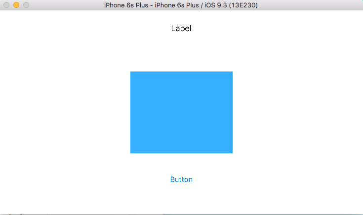
  • We'll start with a simple single-layout app. In the storyboard we see a large white box that represents the ViewController's view (the superview). We can drag various elements into this ViewController's view from the Object Library on the right. I'm going to drag in a Label, an Image View, and a Button.

  • Now out of these three view types, only the Image View actually needs all four constraints. In other words, the label and the button do not need width and height constraints. They only require x and y constraints. That's because these views will adjust to the content that they contain. If a label has a 10-letter word in it, the label will be big enough to show the text by default. This is something you can choose to change depending on the view you're trying to achieve.
  • The first thing you want to do is either draw or wireframe what you'd like your view to look like. Then re-draw in landscape view. Imagine the user interacting with the app. Is one view more important than the other? Will everything fit if the device rotates. How should they grow/shrink? These questions will help guide your autolayout experience.
  • I want all three of my views to be horizontally constrained at the center. I want my image to also be vertically constrained to the center. Then I want the label to be a certain distance away from the image on top and the button to be a certain distance away from the image on the bottom. When the device turns, the image will have to get a little smaller. The label and the button can stay the same.
  • The easiest way to constrain the views to the horizontal axes is to drag them until we see the blue dotted line running down the center of the superview. In this case, the superview is the View Controller's view.

  • Now that all of my sub views are on that dotted blue line in the middle I'm going to constrain them to this location. Click on each subview individually and select the "Align" menu on the bottom of the page. Click "Horizontally in container" and then click "Apply 1 constraint." Now our view will always be aligned to the superview's center x. 

  • You will notice that even after we constrain all three views to the horizontal center (x) that there are red lines on the screen. These lines mean different things depending on their color. 
    • Red means that not all of the constraint requirements are met. You can fix this by adding the missing constraints.
    • Orange means that all of the constraints are there but the placement of the view doesn't match what you defined in the constraint. You can fix that by either updating the frame so the view moves to where the constraint says it should be or by updating the constraints to change their definition so that where the view is currently located is correct.
    • If you see blue lines then you're good to go! All constraints that are needed are there and they match the views' placements in the superview.
  • In this case, we know we have red lines because we haven't defined the (y) vertical placement constraints for any of our objects. We'll start this off by clicking the image view and constraining it to the vertical center. Do this the same way that you constrained the horizontal centers.

  • You'll notice that now even though we have the x and y defined for the image that it's lines are still red. That's because images need width and height constraints as well.
  • In some cases, it's best to constrain the image to a set size. You can do this by clicking on the image and then on the Pin menu on the bottom. You can adjust the width and height and then constrain them to be constant (never changing). 
  • In this case, however, we want the image to shrink when we rotate the device and grow when it's back in portrait so we don't want a constant size. We achieve this affect with Aspect Ratio.
Aspect Ratio
  • Aspect ratios are extremely helpful in setting your size constraints. What they do is set the size of one item in relation to another. So if you set the width of an image in aspect ratio to the width of its superview then as the superview width grows, the image width will grow. You can do the same for the height as well.
  • In the case of this app we actually need to think this through a bit. It's true that when the device rotates from portrait to landscape that the width of the superview is wider, however, the height of the superview is actually smaller. Since our views are laid out one on top of the other and not side by side, we actually need to shrink the image when it rotates to landscape.
  • To do this, we're going to set the aspect ratio of the image's height to the superview's height and then instead of doing the same for the width we're actually going to set the aspect ratio to itself.
  • Let's take this one at a time, first click on the image. Then hit the control key and drag it to the superview. A little box will pop-up with options. You are going to select "Aspect Ratio."

  • Now for some reason when you do this it will set the image width to the superview height which doesn't make sense for our purposes. We need to alter this constraint.
  • On the left-hand side of the screen you'll see the Document Outline. This lists all of the views and subviews in the scene. Select the image from this menu by simply clicking on it. Then on the right-hand side of the screen look at the Utilities menu. There are six icons at the top. Click on the second to last one that looks like a ruler. This is called the Size Inspector. Here you will see all of the constraints that are currently set on that view. So in this case, we see the x and y constraints along with the ratio constraint we just set. 
  • Double-click on the ratio constraint. When you do this, it will open up so you can view the current constraint details and alter them if you like. At the top change the constraints to read Image View.height relation Equal to Superview.Height. 
  • The wording here may seem confusing. It seems like we're setting the height of the image equal to the height of the superview which would be much too large. But if we look below that area we see some more options. In particular, I want you to look at the multiplier. Right now mine is set as 2:5. Which means that the image view's height is slightly less than half the superview's height. I can change this ratio as I please. I want to change it to 3:5 so that my image is slightly bigger than half the superview's height.


  • You won't see any big change except that the orange number line next to the image view changes. This tells us that the current view's measurements do not match the constraint we just set. To fix this we would normally update the frame but because we haven't yet set the width constraint that might make our view look a little crazy. Let's do that first. 
  • Setting the width constraint on itself is similar to setting it on another view. Control click on the image View and drag it in one direction within the same image View. Do not drag it outside of the frame of that image. You will see a similar box as before. Select Aspect Ratio.

  • In the Size Inspector on the right you should see a new constraint appear. Double click on it. Here we see that the image view's width is set Equal to its height. Again, this doesn't mean what it seems which we can tell by the multiplier on the bottom. Mine is currently 15:8 which I will leave for now.
  • Notice that the lines in the view are now blue with the exception of the height constraint that is orange. We know that this is because we updated the ratio but in case you didn't know let me show you how to figure it out.

Structure Menu
  • Back in your document outline on the left, you'll notice that there's a little red arrow at the top. (This will sometimes be orange also, depending on the issues in the view). Click on the arrow to reveal the structure menu. Here we see that there are missing constraints for the button and the label (which we already know because we haven't set their (y) vertical placement yet.)

  • Under misplaced views we also see a listing for the image view. Click on the yellow warning sign. Four choices appear. The two most important choices are:

    • Update frames - this means that you think the constraint is correct but the view is not matching what you want it to look like. When you click this button it will adjust what the view looks like to match your set constraints.
    • Update constraints - this means that you think the view looks right but the constraints are wrong. When you click this button it will keep the view as is and just adjust the constraints that are conflicting.
  • We are going to choose update frame. Then choose fix misplacement. Our image is now humongous so we know that I made it a little too big. Let's go back to the constraint and adjust the ratio until it looks the way we want it. A shortcut to adjusting the frame (rather than using the structure menu) is to click on the "Resolve Autolayout Issues" button on the bottom right.

  • Be careful here! There are options to update the selected view but there's also an option to update all views. Make sure you click the one you want. In this case, we're just going to update the selected view.
  • Looking pretty good but I know I still have to set the y constraints for the label and the button. Let's do the label first. There are a few ways we could constrain this. We could make it a set distance away from the top of the view. Then no matter what size or layout of the device it would be that distance away from the top. Let's think this through, though. If we do that and the height of the view shrinks, like when rotating to landscape view, the label may overlap the image.
  • A better option in this case is to constrain it as a set distance from the image. Control click on the label and drag it to the image. That box will pop up and you should choose "Vertical Spacing." Notice that the line is now blue and the missing constraint for that view went away in the structure menu. This view is done!

  • Now let's do the same thing for the button view. Control click and drag to the image. Again, choose "Vertical Spacing." No more constraint issues! Blue lines for everyone! Hooray!

  • Now if we were to look at the constraints listed for every item on the page we'd see that the label and button each have two constraints: horizontal center with superview and vertical spacing to image view. 
  • Our image view, however has way more. Why is that? Well we have the one for the vertical centering and one for the horizontal centering. But we also set width and height constraints. It's height is constrained to a ratio of the superview and its width is constrained to the ratio of its height. So that's another two constraints that the label and button don't have. The last two are actually the label and the button constraining to it. So like I said, most views only need two, some need four but you could have more than that depending on how your views are constrained to one another.
Testing the View
  • I want to run this view in the simulator but first, because we didn't actually put an image in this project, we can either drag an image in and change the image in the attributes inspector or we can simply give the image a background color that shows when no image is loaded. Let's do that instead, to keep things easy. In the attributes inspector choose a background color then choose a device up top and run.

  • We see that in portrait our image is pretty huge. It looks like it takes up at least the width of the superview, if not more. Now rotate the device by clicking Hardware up top in the file menu and choose rotate left. This actually looks nice! So we need to update things a little. Let's go back to our storyboard.


  • Let's update our width constraint so that the image isn't quite so wide. Under the image's constraints, select ratio to image view. Right now, mine is 15:8. Let's lower that front number a bit and see what we get. I'm going to go with 10. now when we run the app again we see that the width fits within the frame and when you rotate it, it looks great too. Now of course if you had an image that needed to be sized differently (wider than it is tall) you'd have to also update your height constraints accordingly. But for our purposes this looks good.
  • Now, rather than running the app in different simulators there is a little trick to see how it will look on different devices. Click on the Assistant Editor at the top of the screen (looks like overlapping circles).


  • Close all of the other menus so that you can see more of the two screens. In the right screen, towards the top, click on where it says "Automatic" and instead choose "Preview." This will show you a preview of what the app will look like in a device. There's a plus sign on the bottom. If you click that you can look at other devices too.

That's it!

So now you're an autolayout pro! And if not, checkout this Standford Lecture on YouTube about autolayout. This was really helpful for me when I was first learning. Keep practicing with different views and explore all of the tools that are available to help you. And tune in next week to learn about the cosmic power of stack views and how they make your autolayout life so much easier! 

Monday, June 20, 2016

LCD Clock Project


Welcome back fellow Googlers, programmers, and family members that I ask to proof-read all my posts :) Today I'd like to tell you about a project I was assigned a couple of months ago called LCD Clock and how it lead to me being able to use autolayout like a boss. Learn about the project and stay tuned next week for an autolayout tutorial that will ensure that you will be able to constrain your views to heart's content!

LCD Clock Summary 
Digit 8 from xib File.

The LCD Clock assignment was to create a view using the Storboard/xib files that shows the time, in a HH:MM format. Adding SS was optional. AM/PM should be included, as well as the user's ability to change the format to military time, change the text color, and change the background color. In addition to the basic clock we would use NSTimer to ensure the accuracy of our time and blink the dots that separate the hours and minutes. We would also use NSUserDefaults to add persistence in the app. And finally, use autolayout on the views so that when you rotate the device, it auto-adjusts.

NSUserDefaults

A hefty project with extremely important concepts. This was my first taste of persistence within an app. Confusing at first, but as soon as you wrap your head around the idea that it's really just a dictionary that you create then continually update or "save," it isn't too difficult. Much easier than say, using SQL Lite or Core Data, two other persistence methods I would learn in the next project (dun dun dunnnn!!).

I saved my colors as integers which were references to their place within a colorArray.

Time Parsing and NSTimer

Change between standard and military time.
The time in the app was created using Time Parsing to take the time and create a digit that represents each number value in that time. Then this was altered for military time. A switch was provided to alternate between the two formats. There were many ways to layout the numbers. I chose to create a xib file of the number 8. This digit was then used in my storyboard for all numbers in the layout. Depending on what numbers were needed in each digit of the time, segments of the number 8 were hidden or shown. For example, to make a 4, the top, bottom, and bottom-left segments were hidden. When it became 5, the top and bottom segments were re-shown, and the top right segment was hidden. NSTimer adjusted the digits accordingly every second and blinked the dots (show, hide) every half second.

NSTimer to control the clock and the dots.

Defining each digit in terms of the segments that show and are hidden.

Programmatic UI

While the initial colors used for the clock digits and background were set in the storyboard, all additional color combinations were written programmatically. I then coded these colors to change with the user's swipe (background) or long-press (text).

All of the views that needed to change when a user would choose a new color for the clock text.

Autolayout

All of this may sound pretty difficult but it really took me just one week to put this all in place. The second week was spent entirely on autolayout. If you're really struggling with autolayout I recommend reading the Apple Documentation. If you're still struggling, you should visit this site again next Monday when I'll be posting an autolayout guide. I'll be discussing everything - from deciding on your constraints before you start applying them, to the usefulness of stack views in constraining your views. In the meantime, checkout this full project at my github page. Talk to you all again next week!

Final product - portrait, black
backgroud, red text, standard
time format.
Final product - landscape, green background, black text, military time format
which looks almost identical in the AM, aside from the AM view hiding.

Monday, June 6, 2016

Dr. Google Knows Best

Hello fellow Googlers! Today you finally get to learn why I named my blog "Always Googliando." I know this has probably been all you've been thinking about for weeks, keeping you up nights, etc so I thought I'd end the suspense with this last "About Erica" style blog before I get back to my techy posts.

I might put a Paypal link on my
account to raise money for that shirt.
Possibly my next tattoo.
Let me first start by saying I am not affiliated with Google. I do not work for them nor do my posts speak for the company; just in case any of you also study law in your spare time. I'm simply a Google fan. That being said, I may be the BIGGEST Google fan ever. Definitely more than the guy on the left but maybe not as much as the guy on the right (although if a job offer were on the table I'm sure I'd consider this tat).

Yes, I used emojis to name
my folders.
I organize my entire life with Google Drive, Google Photos, Gmail, GCal, and Google Maps (the list goes on). I would not know where I was going, when, with whom and what to bring if it weren't for these apps that I use every single day. For some context, I used to carry around a giant purse and a planner back when I worked at NYU. I'm a super-organized, anal, type-A nut-job and my life was in that planner and purse. Then I got a smart phone. As I added more and more Google Apps to my phone, items came out of my purse and features were removed from my planner. Now I don't carry around a purse at all - just my phone, ID, and Insurance card. If you'd like to see a visual of how this basically happened check out "The Evolution of the Desk." I do still make my husband carry around my lipstick when we go to fancy places but I keep telling him as soon as I have an app that reapplies my lipstick after I eat we can throw that out too. To the left is a snapshot of my phone screen. I wasn't exaggerating in my last post when I said I had over 200 apps that I use regularly.


So now you know my heart looks like this (picture right). You also may have gathered from my last few posts that I love to learn. I went to college, grad school, now I'm in bootcamp and I'd eventually love to get my PHD. I told my mom once that I wished I could just be a professional student because I love school so much. Maybe that's part of the reason that programming is such a good fit. You are CONSTANTLY learning new things. This is partly because technology is changing every day and you need to keep up with the latest trends in order to have your apps stay relevant. But it's also because it would both be impossible to memorize every method you need to make every app you'll ever program AND you'll always have some bugs you can't figure out. Enter Google.

Whenever I encounter a problem that I can't figure out I make a Google search. I hold the command key and click on the first ten pages that come up in new tabs and read them all, looking for the response that makes the most sense for me. If you're a new programmer, don't be ashamed to Google the crap out of everything. You will do this for your entire career. In fact I'd say being a good programmer has as much to do with knowing how to search for solutions as it does with knowing how to write solid code. Often times, one informs the other. And my Google searches don't stop here.

I've used Google for everything since its launch in 1997. I'm sure Smarterchild was jealous. I find quick fixes to problems when I'm out and about by whipping out my phone and making a quick search. My parents say I'm like the MacGyver of Google. I even lovingly referred to Google Search as "Dr. Google" as I tried to figure out how the heck to raise a child when Tino was first born.


Nah, he'll be fine...
- Is it normal for a baby to snore this loud?
- When should he get his first hair cut?
- How do I get him to love the water?
- Will I scar him for life if I dress him up like a snowman for his pictures with Santa?

Just ask Dr. Google. She knows everything (the feminist in me made her a woman doctor).

So since I love to google everything and because some of my in-laws and I exclusively speak Spanish with one another I needed a quicker way to say "I was googling something," than "Esta buscando en la web..." That's why when I was talking to my mother-in-law about how I figured out that I could put plastic bags over his sneakers and take him out in the snow since we didn't have snow boots I said "Estaba googliando y leí un artículo que...." Mami cracked up when she heard me say "googliando," a made-up word that assumes you can take an English word and add "ar" or "ando" to make it a verb. I Spanishified Google like so many have Spanishified English words before me. Some other members of the family have started lovingly using it too and I'm hoping it will go mainstream.

I decided that "Always Googliando" perfectly represents both my love to learn and my love of languages - computer and human. I will always be Googliando and I'm glad you're here to read about what I learn. I hope some Google searches around the globe will bring people to my posts in the future to help them learn something new too!


Tuesday, May 31, 2016

This Teacher Learns a Hard Lesson

Hello and a happy belated Memorial Day to you all! In my last post I told you all how I worked myself to insanity and back in order to be a teacher only to quickly find out that I didn't actually like to teach. Let's talk about that for a minute because I certainly don't want to diss ANY of my amazing teacher friends and family (shout out to Jennifer Pecorella!).

I worked at East Harlem Scholars Academy (EHSA), a Charter School that had preference for students from East Harlem, especially those that were special needs or English Language Learners. At the time the school was in its first year, so in addition to teaching, teachers were expected to put their oars in and contribute in any other way that interested them. For me, that meant doing data analysis for the school. When potential investors would come to visit they would want to see certain metrics that proved the effectiveness of the program. I helped by showing many of the teachers how to track some of this data, building the Excel Workbooks that they could use, and doing some of the data analysis for the head honchos to present to these investors.

As the school Spanish teacher I taught Kindergarten and First grade in a total of six classes a day, four days a week, for 45 minutes a day. It was exactly as I had dreamed it would be - full-time Spanish in small groups in a pull-out model. Teaching this age group is really fun because we got to play games and sing songs all day to the point that they may not have even known they were learning. (Video below is two of my first-grade students dancing together after I taught a lesson about salsa.) By the end of the year it was incredible to see how much they had learned. Reminiscing about it even now, it seems like something I loved, but then I remember the parts that I didn't.


The biggest reason was that as a language teacher you have to teach the same exact lesson to each group of students. And as a charter school, they didn't want us to deviate much from the lesson plan. Saying the exact same thing four times in a row was something that drove me crazy. I couldn't handle that much repetition. By the end of the year I realized that this really just wasn't for me. While there are many amazing teachers out there who are made to this work, I wasn't one of them.


When I first made this realization I was a little annoyed at myself for spending all of that time and energy to get this far only to find that I didn't like my "dream job." My sister, Katie, is a nurse and when she was in school they put the students in the hospitals right away and had them learning hands-on. Many students dropped-out within that first year because they realized right away that nursing wasn't for them. When you go to school to be a teacher you don't really get that hands-on experience until the very end of your education. At that point I had a sneaking suspicion that I wouldn't love teaching but felt like maybe it was jitters and that I was almost done so I should just finish. I can't help but think that if the program was structured differently that I would have made this realization earlier and changed career paths but it wasn't and I didn't so I decided to move on.

It's scary to try something completely new but both of my parents love their jobs so I knew there was a niche out there for me too. I just hadn't found it yet. Looking back, I'm proud of myself for making this tough decision. There are so many people who stay in a career that they don't like for so long because learning something completely new is hard.

After that year at EHSA I realized that I enjoyed the data analysis I was doing more than the teaching. I went back to my roots and found a job at Global Insulation Inc, a small non-union insulation company on Long Island. I worked there for four years as their data analyst / tech adviser and I loved it. I started by improving their systems like I did at NYU and moved on to making new projects in Excel and Google Sheets to help take over some of the manual calculations they were doing. Eventually, the projects I made were so robust that they were becoming too large for Excel / Sheets. It was at that time that I thought about moving some of these projects to the web.


My son, Tino, in his </head> <body> onesie
that my teachers gave me.
I considered becoming a front-end developer because of my art background. I took a course at General Assembly while I was pregnant with my son. I loved the coding aspect of this course but didn't feel as enthusiastic about the User Experience (UX) end of it. I liked making the page look pretty but studying the different kinds of fonts that should be used together and making so many different color choices wasn't for me. I studied back-end programming on my own at Code Academy and enjoyed the work I was doing but then actually missed seeing how things lay out on the page and being in charge of making it prettier. After meeting with a few schools and bootcamps I decided with mobile development I could get the best of both worlds! And who better to design apps than someone who has over 200 on her phone and loves each and every one of them deeply.

I enrolled here at TurnToTech and I am absolutely head-over-heels in LOVE with mobile development. I'm so excited to finally find the career for me and can't wait to get my first job as a programmer.

Next week I'll tell you the meaning behind the blog name, "Always Googliando." Until then, happy coding! :)


Monday, May 23, 2016

Steadfast at Steinhardt

Welcome back to 'Always Googliando,' where we're taking a trip down memory lane in response to readers asking me about my blog name and my back story. We'll pick up here where My Start At SUNY New Paltz left off.

I graduated from SUNY New Paltz in 2008 with a double major in Spanish and Italian and a minor in Art Studio. Wanting to teach I knew I had to get my masters in Education to acquire the necessary certifications. I chose NYU because they offer a program to get a dual certification in foreign language and ESL education. With certs in two foreign languages and ESL I would be more marketable when looking for a job.


The problem with NYU was that it's a small fortune to attend. I've had a job since I was 11 years old. If there's one thing I know how to do it's work and work hard. I did some research and found out that if you work for NYU Langone Medical Center in the School of Medicine that you get partial tuition remission. I applied to anything and everything and got myself an AMAZING job in the Emergency Department. More on that later.


I lived in a one-bedroom apartment (that we split into a small 3 bedroom) in Stuy Town with one of my brothers, Joe and my cousin, Danny. Joe is a rubyist and one of the few extremely intelligent guys that I know that also happens to have a wonderful, non-droid-like personality. Most evenings he can be found at his standing desk, coding the hours away while singing and dancing to Ghostland Observatory. (Side note, he now owns his own company, Def Method. A future blog about that in the future!) Danny is a kind, hilarious and unabashed soul who enjoys a good time with good people. He shamelessly does and says whatever he is in the mood to do and say. Many times it's something sweet but most of the time it's something so ridiculously funny that you burst out laughing somewhere inappropriate - like an art museum or a school play. It was important to have these knuckleheads in my corner because going to school at NYU, student teaching, and working a full-time job turned out to be a little tricky.

Me and Joey - not sure what we're doing here...

Danny during a blizzard in his Estrada glasses.


This is a ninja.

At NYU I was hired by Jessica Kovac as an assistant to the Faculty Group Practice for the ER. Basically I started doing data entry and a little data analysis. Having zero background in that sorta thing I took every single professional development course that NYU had to offer, which was a lot. They have classes on everything from handling stress to Advanced Microsoft Office. I took them all and I got pretty good at that data analysis thing. So good, in fact, I improved all of the existing programs that we had so that most were automated and the rest were 10 times faster than they were when I started. I was a computer ninja with a black belt in Excel.


My coworker, Meaghan, and I winning a Team
Achievement award at NYU.


At that point, my coworker and I struggled with whether to let our supervisor know and risk losing full-time status. In the end, we showed her what we had done and she was so impressed that she not only assigned us new, more interesting projects to work on, but met with us individually to hear about our other interests and helped us seek out opportunities at the hospital that we would enjoy. Whenever anyone asks me who the best boss I ever had was, Jessica Kovac is always my answer; for this reason and many more.

I spent two happy years at NYU as a data analyst and then one kind of insane year where student teaching came into play. I met with Jessica to devise a way that I could fit all three priorities in my life and ended up with a schedule where I got up at 4:30 each morning and got home around 9:30 each night. Jessica reminded me that she already knew how hard of a worker I was and that if I finished what needed to get done to just leave - not to stay the full hours just for the sake of it. She trusted my work. Like I said, best boss ever.


Hanging out after class with our teacher.


Joe and Danny did their best to take the burden off me as well. Danny took over cooking most of the meals and Joe took over the shopping. They split some of the chores but, being the neat freak I am, I still spent a lot of my weekends tidying things up. After the first semester, even with all of that help, I was still a wreck. The culmination of stress and exhaustion happened when I woke up and actually hallucinated. Then later that day I was on my way to meet my mom at Penn to go home for the weekend. I had to stop the bus early and run off to vomit behind a Halal stand in front of Macy's. In December, Macy's is pretty crowded with people looking at the Christmas windows so I was lucky enough to have a great audience for this low-point.

Me and Momsie the Bobmsie
That weekend my mom (aka "momsie the bombsie" aka the best mom ever) helped me come up with a plan for the second (and last) semester to de-stress further. She agreed to come in to Manhattan every Wednesday to cook me dinner, clean my apartment and relax with me. A huge sacrifice for her in money and time, especially time away from my dad. Yes, they're one of those rare couples that are still madly in love after 36 years. A friend of mine also suggested that I get out more on the weekends (you know, instead of sleeping and studying the whole time), even if it meant coming to her place to watch a movie or doing something else low-key. With even more people helping me, I made it through the last semester with my sanity in tact.


I'd say if there was a theme for my life that I started to tap into at this point it would be that I can accomplish absolutely ANYTHING that I want as long as I want it badly enough and have my family by my side. No one accomplishes anything great without some support from their loved ones. Whether that means encouragement from your sister, 30 Rock marathons with your mother to clear your head, or Whisky Fridays with your brother and cousin to escape the monotony, you are so much better off if you let those people, who genuinely want to help you succeed, in.

Steinhardt graduation, 2011
From Left to Right: Me, Jonna Dowling, Shannon Reilly
I graduated NYU with a 4.0 and a master's degree in both Foreign Language and ESL, grades K-12. Not only that, but I had gained this data analysis expertise to my skill set. I went into the job search confident and found a job within a month as a Spanish teacher.

Who knew I wouldn't like teaching?

Join me next week to catch up to present-day Erica. Leaving a job as a teacher after that blood, sweat, and tears (not to mention about $60K in student loans) and following a brand new path.